Let’s take a look…
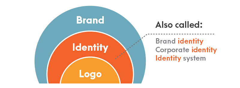
The first thing we need to clear up is the difference between your brand, your brand identity, and your logo design. Don’t be fooled, they’re not the same! However, you do need to pay close attention to each of them.
Your Brand
Your brand is your perceived corporate image as a whole. This is your
brand mission, vision, story, and brand strategy, all wrapped together. If you’re struggling to get your head around what your brand is, and how
you begin to form your brand, then take a look at The Ultimate Small
Business Branding Guide. It’s packed full of tips and advice for
branding your business.Your brand identity is the visual representation of your overall brand. It’s how your brand communicates visually. And sure, your logo design is part of your brand identity, but there’s more to it than that. It’s the language you use, the typographic choices you make, the style of photography in your brand communication, and more. When you work with a design agency to help design and develop your brand, they should wrap up your brand identity in a document, often called Brand Identity Guidelines. This can then be used when working with others to help communicate your brand visually.

Your logo design identifies your business in its simplest form using a logo mark, typographic solution, or combination of both.
That’s all there is to it. Your logo design is the simplest visual representation of your business possible.
From Nike’s tick, to McDonald’s Golden Arches, the best logos are as simple as possible.
As quoted by creative, Antoine de Saint-Exupery:
- A designer knows he has achieved perfection not when there is nothing left to add, but when there is nothing left to take away.
- When looking at your own logo design, keep that in mind.
What Does Logo Design Do?
Your logo design has several jobs. Let’s take a look at each of them in more detail.
Your Logo Design Builds Trust and Brand Recognition
Building trust and recognition with your audience and customers can play a major part in your businesses success. When you put your logo on something, you’re officially giving it “the
seal of approval.” And just like film critics, food critics, and other
reviewers, that means something. By having your logo design on something, you’re guaranteeing it lives
up to the promise your brand has made, and your customers can trust it. People recognize logos. And that’s one of the major things your logo design should do for you. Build recognition and trust. Think about Nike’s logo. It appears everywhere, and you know what it is every time. Your logo needs to do the same for your customers.Your Logo Design Makes You Stand Out From The Competition
Away from naming your company different things, your logo design helps you differentiate from your competition.
I bet you can think of the McDonald’s logo in your head right now. The Burger King logo however could be a little fuzzy.
For reference, here they are:

The Golden Arches win out every time. You know what they are. The logo makes me smell McDonald’s chips (fries), and makes me want to jump into my car and head out to get one.
And that’s because…
Your Logo Design Visually Represents Your Brand in its Most Basic Form
McDonald’s logo wins out, because it visually represents the brand in the most basic form possible.The Golden Arches form an M, the first letter in McDonald’s. However, the fact “the arches” are golden, reminds you of fries. Then the smell, then the desire. The whole logo conjures up thoughts of the brand.
They’ve used their logo to simply represent their brand.
And because of that, they have one of the most successful logos of all time.
For the record, I’m not the biggest fan of McDonald’s, but you can’t argue with the strength of their brand, brand identity, and logo design.
What Should a Logo Design Be?
Your logo design should be five key things. We’ve covered these before in our 7 Steps to a More Effective Logo Design post, but let’s have a quick refresher…
1. Memorable
Your logo design must be memorable. If people can’t remember it, what’s the point in it? By being memorable, you build recognition. And to be memorable, your logo must be…
2. Simple
The simpler the better. Reduce your logo down until only the heart of the design remains, then ask yourself “does it still represent our business?” If so, then you’re onto a winner.
3. Versatile
Your logo design will be used across a huge range of platforms. From
your website to social media, to press releases, and huge billboard
designs.So it needs to be versatile. Your logo design should work at 2mm x 2mm as well as 100m x 100m.
On that note, make sure you have your logo design as both a raster and a vector format.
Raster is a file format such as JPEG or PNG. Vector is an EPS or Illustrator file. Your designer should provide you with both.
4. Appropriate
You need your logo to be appropriate. In the Financial Sector? Possibly not bright pink. Although maybe your brand has been setup to be radical and different, so pink would be a great choice!
Funeral director? Let’s stay away from Comic Sans and bold colourful typography.
Appropriateness is key. You don’t want to turn off your potential customers.
5. Timeless
Timelessness in a logo design is vital. And I feel there’s a bigger
post coming here, but logo design “trends” are rubbish. Stay away from
them.Coca Cola’s logo has barely changed. Because it never goes out of date. It doesn’t follow trends. It’s consistent and therefore remains relevant.
Following stupid online logo design trends is a surefire way to guarantee you need to redesign your logo next year. Therefore losing any brand equity or brand loyalty you’ve built with your customers.

What Elements Make Up a Logo Design?
Now that we know what your logo design should do, let’s look at the four key elements that make a logo.
1. Typography
The typography is the text in your logo design. This will usually be
your business name, but you might also opt for a slogan or tagline.
2. Logo Mark
The logo mark is “the picture bit.” This is what a lot of people are talking about when they simply reference logo design.A logo mark will often accompany the typography. Some people go for an abstract logo, others go for a text based logo, or literal representation of what their business is about.
At Canny, we prefer to create logo marks and designs that have a concept behind them. So we combine elements, or use them to communicate something else.
For example:

Our work with letsg.ooo combines a folded paper aeroplane, with an abacus. The brand is about traveling, and traveling on a light budget. Money and travel combined.
By combining ideas and visuals, you can come up with a unique concept that really helps to differentiate your brand.
3. Color
Beyond the typography and mark, is colour. Different colours communicate different things.Let’s take at one example:
The colour blue is used to communicate trust and a sense of “establishment.” Blue is often used in the financial sector for this reason.
And another example:
Green is often used for natural and organic products. It communicates growth, nature, development, outdoors, and fresh.
Colour is an important element of your logo design. One of our favourite things to do is ensure your logo works in both colour and black and white.
That way, you don’t fall foul of any logo design trends and have something to carry your brand forward into the future!
4. Context
Your logo design needs context. Think about when and where your logo will be applied, and test it in those scenarios.We often see logo designs on websites, shop fronts, printed material, advertising campaigns, and more.
It’s important that your logo design is versatile and works no matter your communication method.
Our Favorite Logo Designs
At Canny, we often have discussions around our favorite ever logo designs. And which of them is the most effective.No matter how heated the arguments and debates get, there are three names that crop up on every occasion.
FeedEx McDonald’s Nike

FedEx
Founded in 1973 by Fredrick W. Smith, FedEx is an abbreviation of the full company name, “Federal Express.”FedEx have had an interesting logo design history. Originally they had a logo designed by Richard Runyan. The original logo helped FedEx become successful.
In 1994, the logo was replaced with the logo design we know today, designed by Lindon Leader, of Landor Associates.
The space between the E and X forms a small arrow hidden between them. This is meant to symbolise FedEx’s speed and accuracy.
And once you’ve seen it, you can’t unsee it.

McDonald’s
We’ve already talked a lot about McDonald’s in this post. But they do have a great logo design.Originally known as “McDonald’s Famous Barbeque”, McDonald’s logo didn’t start with The Golden Arches we’ve all come to know.
The original 1940 logo featured the company name, with two parallel lines emphasis the “famous” element. The 1948 logo design was a lot more complex, white text on black background and the introduction of a character.
In 1953, although slightly creepy, the character became the focus. The mascot was known as Speedy and the logo wasn’t all that successful.
Then finally, in 1960, architect Stanley Meston had the brain wave for The Golden Arches. Originally the logo featured a dash cutting across it, which was phased out by 1968.
And that’s how The Golden Arches were born. For a more detailed overview, check out Wikipedia’s article on the McDonald’s logo.
Also, if you’ve not seen the film The Founder, with Michael Keaton playing Ray Kroc, who helped make McDonald’s famous, check it out. It’s amazing!

Nike
And finally, we come to Nike, the World’s most valuable sports brand.Initially founded as Blue Ribbon Sports, the brand Nike didn’t come into existence until 1971, when they started production of their own sports footwear.
Nike’s iconic “Swoosh” was chosen by co-founder Phillip Knight. But it was chosen in a half heated manner. Reportedly, he said “I don’t love it, but it will grow on me.”
Now, the Nike logo design is one of the most iconic logos in the world.
The logo is that iconic, that in 1995, the company chose to remove the brand name altogether, leaving the Swoosh as the sole logo mark of the company. That’s versatility and brand recognition.
Conclusion: What is Logo Design?
Put simply; your logo represents your business brand. It’s something simple that, as you build brand loyalty, your customers come to trust and recognize.
We see logo design every day, most logo design is used in a business context, or to represent a business.


